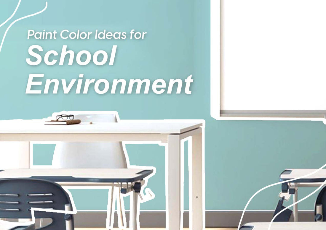

A classrom is the most used place for students, where they spent time studying the most, or where they laughing together the most. When choosing the right paint color, it must be one that create either a calm and anti-stress atmosphere, or a fun and profuctive atmosphere, and it's up to you for which kind of feeling you want your student get from the class design.
Blue is one of the most effective classroom colors. It has a lot of positive traits such as enhances creativity and alertness; promotes tranquility; improves overall health, memory, and mood; lessens fatigue and depression.

White conveys sterility, simplicity, clarity, and purity; hygienic. It can also be a good dominant color for a classroom if it’s accompanied by a colorful accent wall.

In small doses, yellow can be effective in maintaining students’ awareness in the classroom. Yellow is the most joyful color, and it can promotes awareness; helps to release serotonin for happy mood.
.
.
.

Due to its positive effects on concentration, green is a great option for libraries, where students need to focus on their studies. Similar to green, blue is also soothing to the eyes, and is often a most preferred option for interior design, given the availability of multiple shades.

Another great recommendation for libraries is neutral colors. The use of brighter neutrals gives your library space a more open, clean. and breezy look. Muted or darker neutrals can give library a cozier, but streamlined appearance.

.
.
.

Warm colors such as yellow and orange’s impact on appetite makes it an appropriate color for a school cafeteria. Which is why they are the most common colors used by not just the restaurant industry, but the food industry as a whole.

Neutral colors like white, beige, gray, and brown are also excellent colors to incorporate into a school cafetaria's decor. When used as an accent, they can denote sophistication, cleanliness and uniformity, making them ideal for a nice lunch atmosphere.
.
.
.

Action-oriented red and highly-saturated joyful yellow may encourage the necessary physical responses in a school gym setting. Red is the most powerful intense color that could raise a room's energy level. But if you want to associate more warmth, friendship and happy atmosphere in the gym, you might opt for yellow.

.
.
.

You can be a little more “free” with your color and design choices here, as it is not the main place for learning and concentration. We suggest you to consider using the school’s colors and logo to create a sense of pride and identity here.


