Collection: Wabi Sabi

According to the ancient Japanese worldview, wabi sabi is all about embracing the beauty of the imperfect. The key of a wabi sabi interior, is designing a space Where you can feel at home among the simple things and natural materials, with uneven and asymmetric mismatched decor.
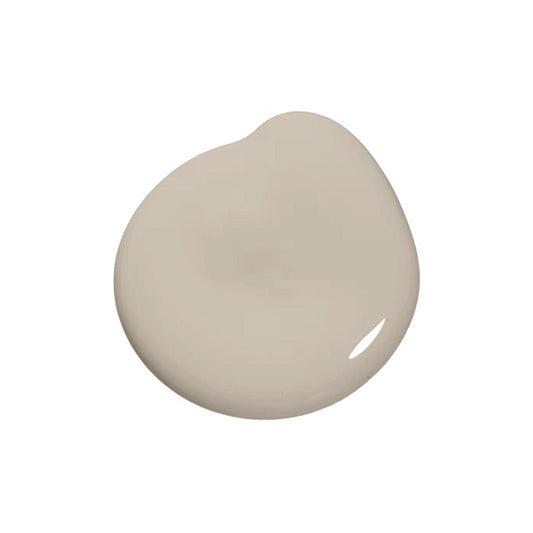
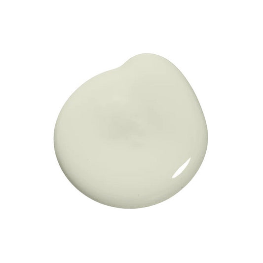
It is absolutely no surprise that a wabi-sabi color palette is inspired by the nature. You'll see plenty of calm and beautiful earth tones that reflect the simpicity or nature.

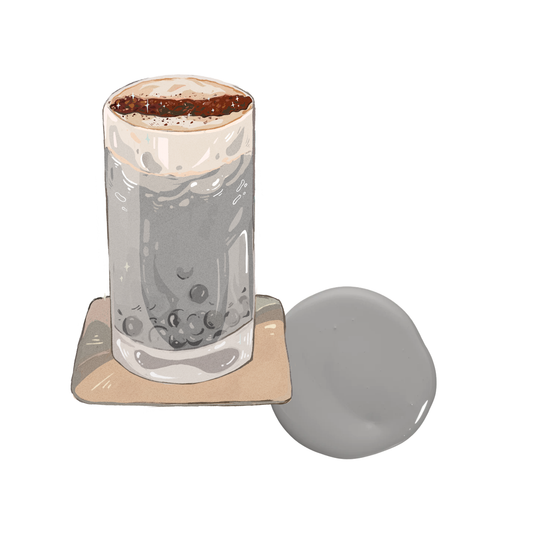
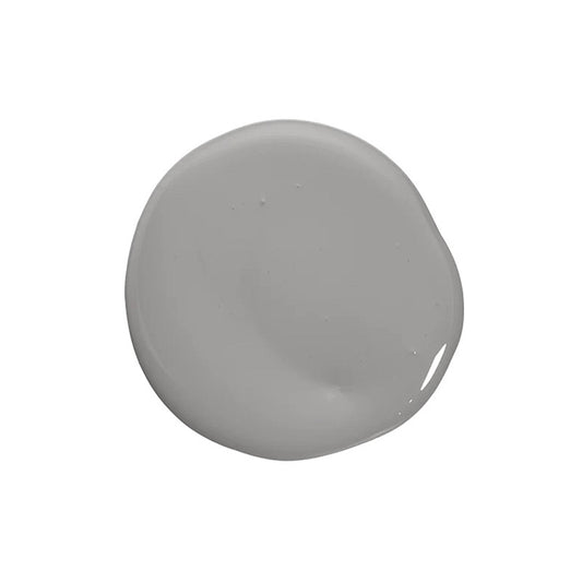
With traditional Japanese style, you might think natural materials have to be bamboo or cane. This isn't wrong, but wabi-sabi includes so much more, take example of the neutral greyish colors of stone and raw concrete.

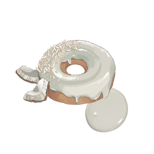
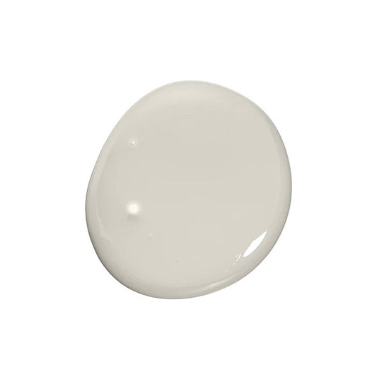
Combining neutral-painted walls with a wabi sabl-themed room will provide you a calm spaciousness that will show off your other wabi-sabi pieces. These neutra colors like or whites and shades of arev are never do out of stvle. boosting your contidence to pour more creativity into your wabi sabi room.

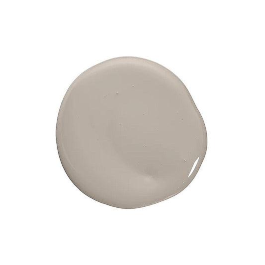
Wabi sabi embraces age in decor, lean toward the vintage and weathered rather than modern. Therefore, the color of browns are a very good option to enhance this concept. From light beige, to almond, to red bean colors, there is nothing more "nature" than the color of the soil and the trees.

Since natural lighting is important in wabi-sabi design, many homes prefer lighter walls overall décor with darker accents sprinkled throughout. However, if you already have enough light and interested to try something new, darker walls like deep dark green or toasted brown are your choice.

The fundamental principle of wabi sabi interior design is connection to earth and natural materials, but with an accent to authenticity. Wabi sabi is an ideal suplement to biophilic interior which also focuses on natural elements and natural lighting. Combine Noroo Paint's wabi sabi palette together with some indoor plants and you will get a match made in heaven.

-
 Sale
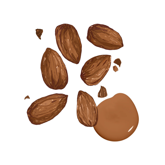
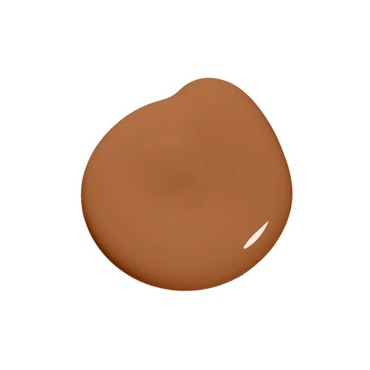
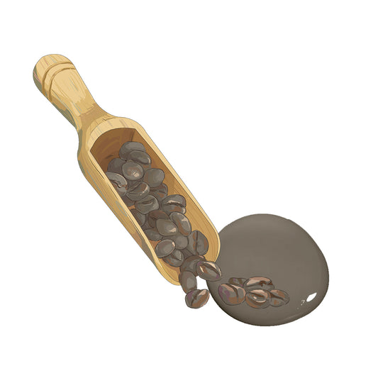
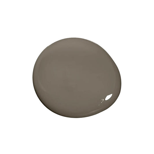
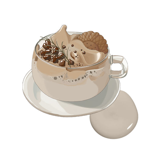
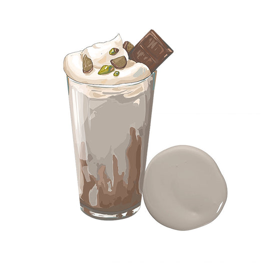
SaleRoasted Beans
Regular price From $33.00 SGDRegular priceUnit price per$128.00 SGDSale price From $33.00 SGDSale -
 Sale
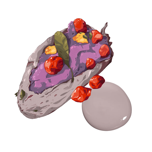
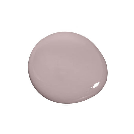
SalePurple Yam
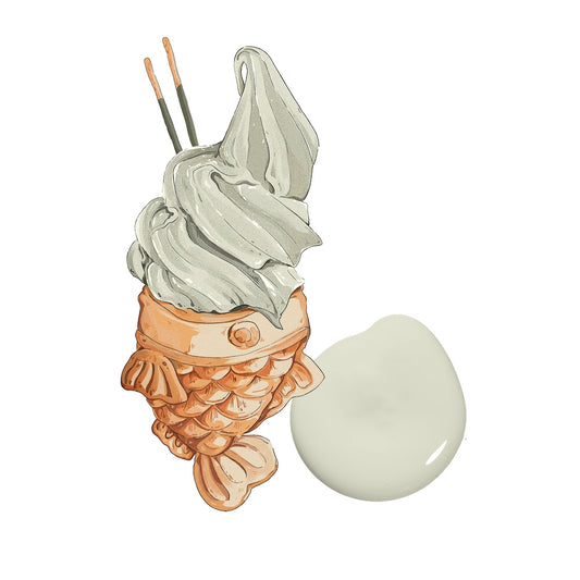
Regular price From $33.00 SGDRegular priceUnit price per$128.00 SGDSale price From $33.00 SGDSale -
 Sale
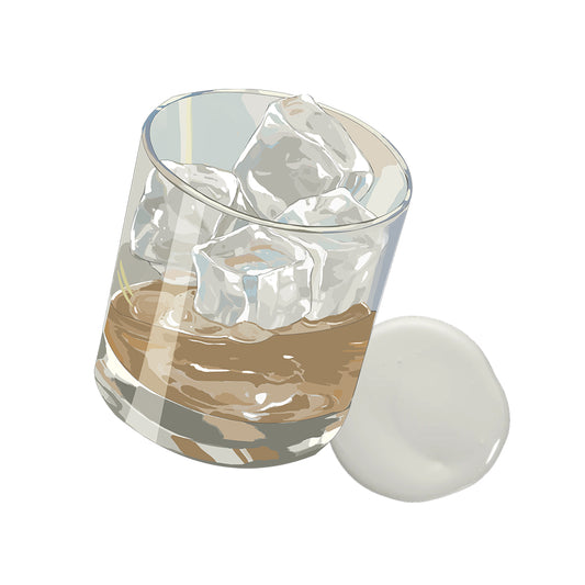
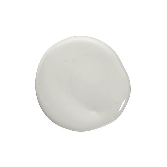
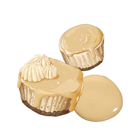
SaleSalted Caramel
Regular price From $33.00 SGDRegular priceUnit price per$128.00 SGDSale price From $33.00 SGDSale -
 Sale
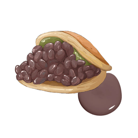
SaleAzuki Bean
Regular price From $33.00 SGDRegular priceUnit price per$128.00 SGDSale price From $33.00 SGDSale -
 Sale
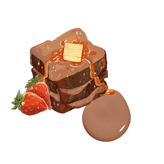
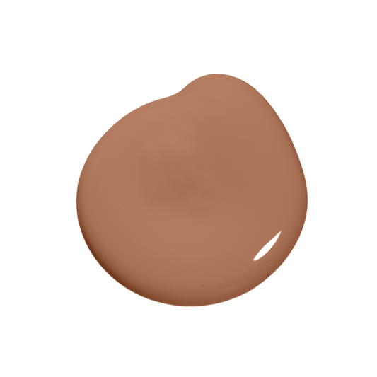
SaleFrench Toast
Regular price From $33.00 SGDRegular priceUnit price per$128.00 SGDSale price From $33.00 SGDSale -
 Sale
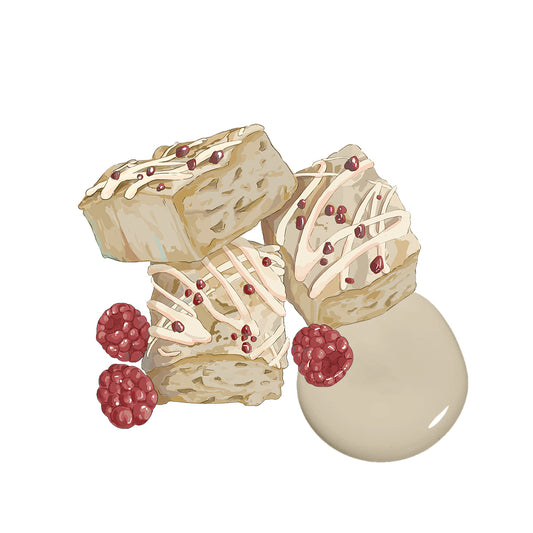
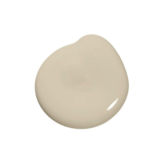
SaleSweet Blondie
Regular price From $33.00 SGDRegular priceUnit price per$128.00 SGDSale price From $33.00 SGDSale -
 Sale
SaleLight Mocha
Regular price From $33.00 SGDRegular priceUnit price per$128.00 SGDSale price From $33.00 SGDSale -
 Sale
SaleMatcha Extract
Regular price From $33.00 SGDRegular priceUnit price per$128.00 SGDSale price From $33.00 SGDSale -
 Sale
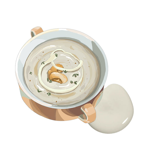
SaleMushroom Cream
Regular price From $33.00 SGDRegular priceUnit price per$128.00 SGDSale price From $33.00 SGDSale -
 Sale
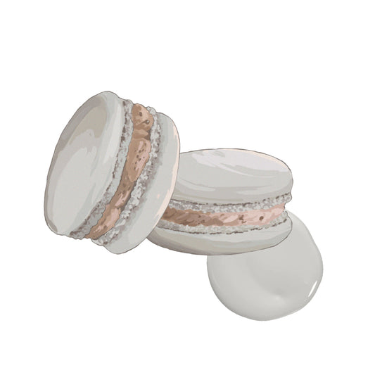
SaleCookies and Cream
Regular price From $33.00 SGDRegular priceUnit price per$128.00 SGDSale price From $33.00 SGDSale -
 Sale
SaleSweet Malt
Regular price From $33.00 SGDRegular priceUnit price per$128.00 SGDSale price From $33.00 SGDSale -
 Sale
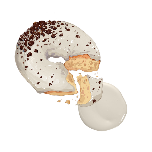
SaleDonut Baked
Regular price From $33.00 SGDRegular priceUnit price per$128.00 SGDSale price From $33.00 SGDSale -
 Sale
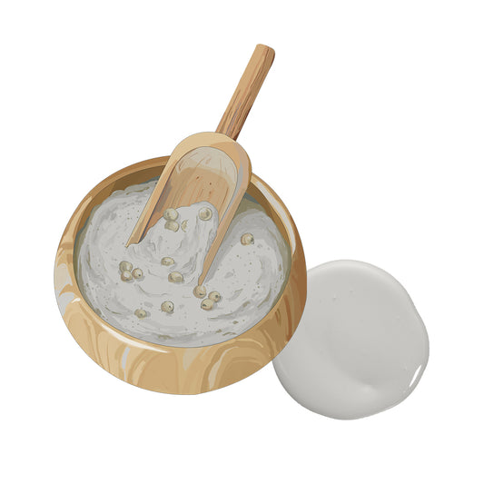
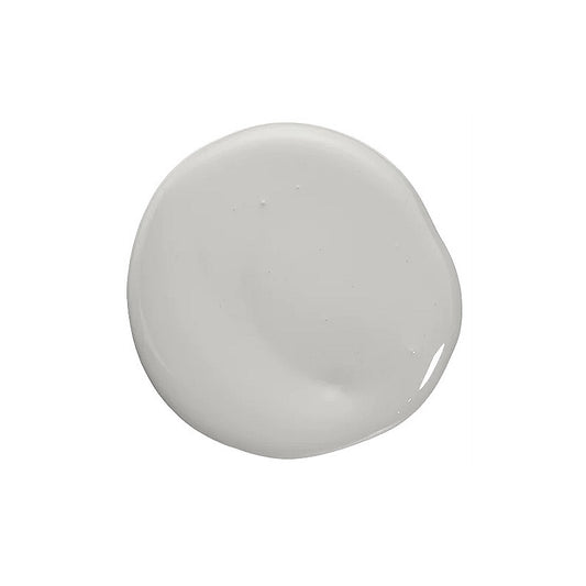
SaleWhite Pepper
Regular price From $33.00 SGDRegular priceUnit price per$128.00 SGDSale price From $33.00 SGDSale -
 Sale
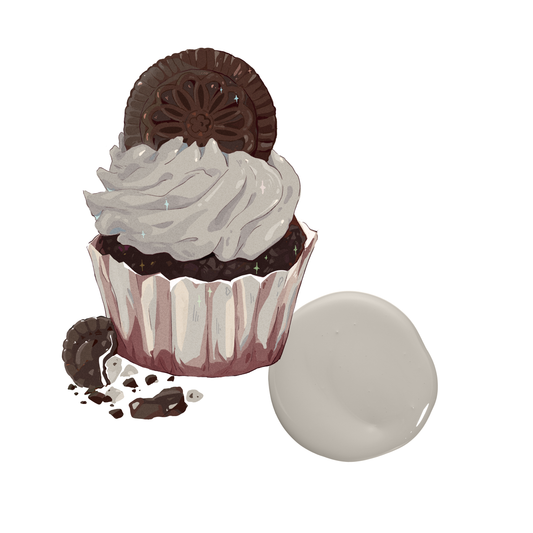
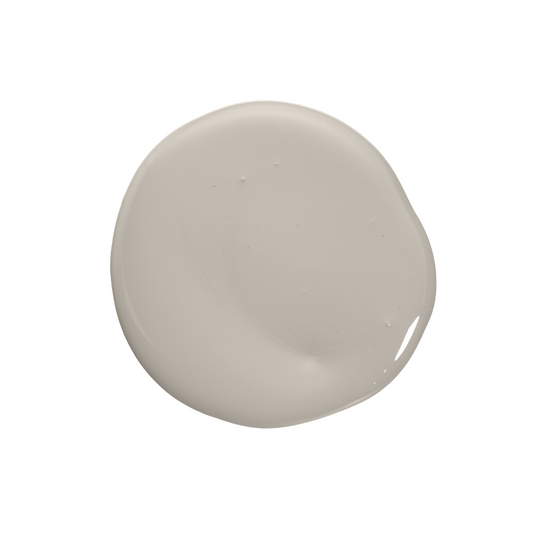
SaleChoco Cupcakes
Regular price From $33.00 SGDRegular priceUnit price per$128.00 SGDSale price From $33.00 SGDSale -
 Sale
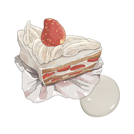
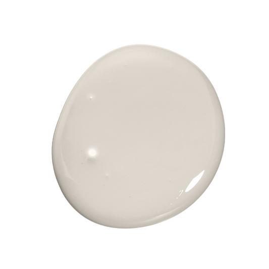
SaleWhite Delight
Regular price From $33.00 SGDRegular priceUnit price per$128.00 SGDSale price From $33.00 SGDSale -
 Sale
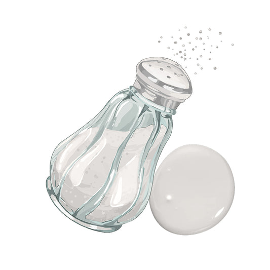
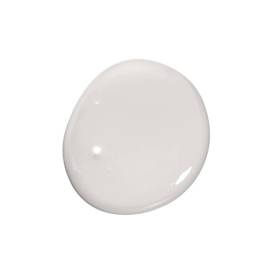
SalePepper Shaker
Regular price From $33.00 SGDRegular priceUnit price per$128.00 SGDSale price From $33.00 SGDSale